우리팀은 마케팅 데이터 군집 프로젝트를 진행하기로 했다.
팀장은 바로 나!
데이터 셋
Advanced Marketing and Retail Analyst E-comerce
Advanced Marketing and Retail Analyst E-comerce
Data Science with ML
www.kaggle.com
우선 결측치를 확인해본 결과, 모두 드랍하기로 결정했다.
df.dropna(inplace=True)
팀원들과 매출, 고객, 배송, 상품 이렇게 총 네 개로 나눠서 각자 EDA를 진행하기로 했다.
내가 맡은 부분은 매출!
우선 이 데이터는
2023-03-04 09:43:00 ~ 2025-01-29 15:10:00 까지의 데이터이다
월별 매출
df['year_month'] = df['order_approved_at'].dt.to_period('M').astype(str)
monthly_orders = df.groupby('year_month')['order_id'].count().reset_index()
monthly_orders.rename(columns={'order_id': 'order_count'}, inplace=True)
plt.figure(figsize=(12, 6))
sns.lineplot(x='year_month', y='order_count', data=monthly_orders, marker='o')
plt.title('월별 주문 건수 추이')
plt.xlabel('연-월')
plt.ylabel('주문 수')
plt.xticks(rotation=45)
plt.tight_layout()
plt.show()
이 기업의 매출은 갈수록 높아지는 추세이고 2024년 4월 매출이 가장 우수하다,
monthly_orders = df.groupby('year_month')['price'].sum().round().reset_index()

plt.figure(figsize=(12, 6))
sns.lineplot(x='year_month', y='price', data=monthly_orders, marker='o')
plt.title('월별 주문 건수 추이')
plt.xlabel('연-월')
plt.ylabel('주문 금액')
plt.xticks(rotation=45)
plt.tight_layout()
plt.show()
금액으로 봐도 별반 다를 것은 없다.
시간 별, 요일 별 매출
fig, axs = plt.subplots(figsize=(12, 4), ncols=2)

cat_features = ['hour', 'weekday']  # 원하는 항목만 남기기

for i, feature in enumerate(cat_features):
    sns.countplot(x=feature, data=df, ax=axs[i])
    axs[i].set_title(f'Count by {feature}')

plt.tight_layout()
plt.show()

오전 2시가 가장 소비가 높고, 평일에 소비가 더 높은 편이다.
나라별 매출
sns.countplot(x='country',data = df)
plt.xticks(rotation =90)
plt.show()
한국과 중국의 매출이 가장 높다.
df_country = df.groupby('country')['price'].mean().round().reset_index()
sns.barplot(x='country',y='price',data=df_country)
plt.xticks(rotation=90)
plt.show()

평균 소비 금액은 비슷한편이다.
제품 금액 별 매출
plt.figure(figsize=(10, 6))
sns.histplot(df['price'], bins=100, kde=True)  # kde=True는 부드러운 곡선도 같이 표시
plt.title('금액 분포')
plt.xlabel('금액')
plt.ylabel('건수')
plt.show()
저렴한 물건 위주로 잘나가는 편이다.
결제 수단 별 매출
sns.countplot(x='payment_type',data=df)
plt.show()
df_pay = df.groupby('payment_type')['price'].mean().round().reset_index()
df_pay.sort_values('price',ascending=False,inplace=True)
sns.barplot(x='payment_type',y='price',data=df_pay)
plt.ylabel('평균금액')
plt.show()
신용카드를 가장 많이 사용하지만 평균 금액은 비슷한 편이다.
리뷰 점수 별 매출
fig, axs = plt.subplots(figsize=(12, 4), ncols=3)
sns.countplot(x='review_score',data= df,ax=axs[0])
axs[0].set_title('리뷰 점수별 개수')
axs[0].set_ylabel('건수')

df_review = df.groupby('review_score')['price'].mean().round().reset_index()
sns.barplot(x='review_score',y='price',data=df_review,ax=axs[1])
axs[1].set_title('리뷰 점수별 평균 금액')
axs[1].set_ylabel('평균 가격')
df_review1 = df.groupby('review_score')['price'].median().round().reset_index()
sns.barplot(x='review_score',y='price',data=df_review1,ax=axs[2])
axs[2].set_title('리뷰 점수별 중앙값 금액')
axs[2].set_ylabel('중앙값 가격')

plt.tight_layout()
plt.show()
리뷰 점수는 3점이 가장 많다. 하지만 매출과는 별 관계 없어보임.
마케팅 동의와 매출
sns.countplot(x='marketing_info_agree',data=df)
plt.show()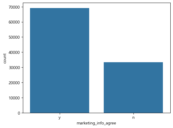
주문 한 사람들 중 마케팅 동의 한 사람이 많은 것을 보아 마케팅 동의 여부가 매출에 관계가 있다고 판단됨.
결론
한국과 중국을 타겟으로 한 기업이다.
저렴한 제품이 잘나간다.
마케팅 동의를 할 수록 소비율이 올라간다.
오전 2시와 평일에 매출이 높다.
이걸 토대로 컬럼 다듬고 파생변수 생성하고 군집에 넣어봐야겠다.
'데이터분석 6기 > 본캠프' 카테고리의 다른 글
| 2025-04-22 심화 프로젝트 - 군집(PCA, KMeans, DBSCAN) (1) | 2025.04.22 |
|---|---|
| 2025-04-21 심화 프로젝트 EDA 2 (0) | 2025.04.21 |
| 2025-04-17 머신러닝 총 정리 (회귀~분류) (0) | 2025.04.17 |
| 2025-04-16 통계 총 정리 (1) | 2025.04.16 |
| 2025-04-14 머신러닝 6 (0) | 2025.04.14 |